Creating Compelling Infographics and Visual Communications

Infographics and data visualizations are powerful ways to communicate to your audience about complex topics. Seeing symbols, images, and graphics that communicate ideas alongside written or spoken information improves comprehension and engagement with a subject.
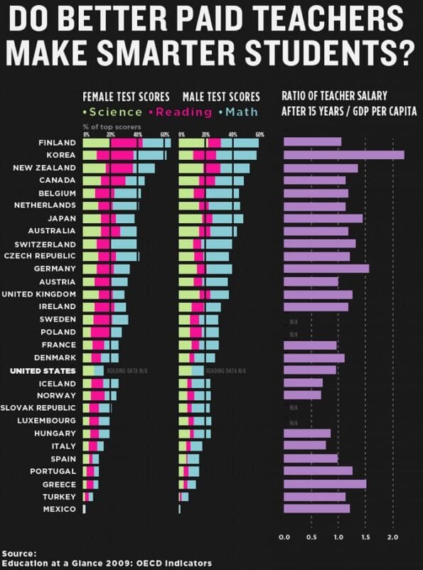
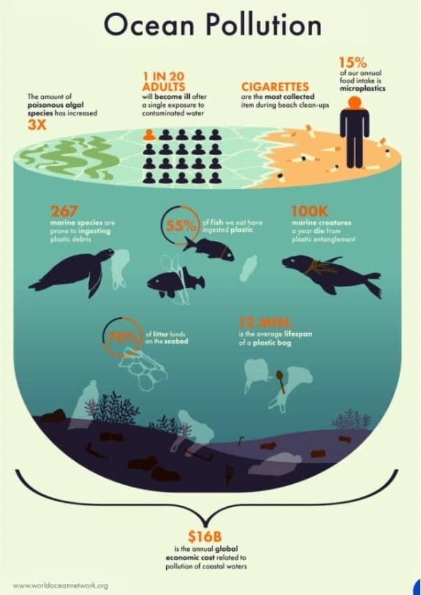
Below are examples of two infographics
- Which one do you find more eye-catching and fun to look at?
- Which infographic gets its point across faster and is easier to understand?
So how can you create more effective infographics?
Here are some tips for creating the best infographics to get your message across:

Avoid complexity
Most people value simplicity and want to understand your message quickly. Keep your messages short and sweet, do not write full sentences, but use short phrases, key terms, and statistics strategically.
Lastly, use complex graphs and statistical displays wisely, if your audience cannot understand the main point of the graph fairly quickly, it is likely taking away from the point you are trying to make.

Use color and organization to your advantage
Using color to group and organize information on your infographic will impact how quickly your viewers will understand your information. Limit yourself to using 3-5 complementing colors to avoid complexity and keep your graphic simple.
Also make sure you use highly contrasting colors for your background and text so your audience can clearly read your content.

Alignment and flow of ideas
How you arrange information, use space, and guide the viewers’ eye through your infographic impacts how your viewer will engage with the information you are presenting.
Make sure your headings and titles are large in scale compared to other content and short but informative. Consider using a grid or template to arrange the elements of your infographic so you can make sure they are aligned and visually harmonious.

Make your main message your focal point
Your viewers’ attention will naturally gravitate to certain elements in your graphic that have standout color, font size, and placement, so make sure the focal point of your graphic is drawing them to your most important takeaways.
Use graphics and symbols to emphasize and draw their eye to the most important information.
You don’t need to start from scratch!
Here are some recommended free platforms and tools for designing effective infographics:
