Graphing Ordinal Data
Graphing ordinal data can be effectively done using bar charts, histograms, or stacked bar charts. These methods display the order of categories while showing frequencies or proportions for each category.
For graphing ordinal data, it’s important to represent the inherent order of the categories. Here are some effective options for displaying ordinal data:
Bar Chart
A bar chart is a versatile option for ordinal data, similar to its use with nominal data. Each bar represents a category, and the height (or length, if horizontal) corresponds to the frequency or count of that category. Bar charts are easy to understand and can clearly display the order of the categories by arranging them in sequence. When using a bar chart for ordinal data, make sure to arrange the bars in order from the lowest to the highest category (or vice versa), such as survey responses (e.g., “Strongly Disagree” to “Strongly Agree”).
The following tutorial covers how to create bar charts in Excel and in Google Sheets:
Histogram
Although traditionally used for continuous data, a histogram can also represent ordinal data by displaying the frequency of categories along a number line. Histograms can show the distribution of ordinal data and help identify patterns or trends. Useful when the ordinal data categories are represented by numerical ranges or grades, such as age groups or income brackets.
Stacked Bar Chart
A stacked bar chart shows multiple ordinal categories within a single bar, with each segment of the bar representing a different category, stacked on top of one another. Stacked bar charts allow comparison of the total frequencies and the distribution of categories within each group. Ideal for comparing distributions across different groups (e.g., levels of satisfaction across multiple products or services).
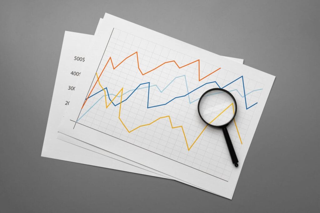
Line Chart
A line chart can represent ordinal data by plotting points in the order of the categories and connecting them with lines. Line charts highlight trends and changes over time or categories, emphasizing the order of the data. Effective when the ordinal data represents a progression or trend, such as ratings over time (e.g., customer satisfaction over several months).
