Menu

Box and Whisker Plots
A box and whisker plot, or box plot, is a graphical representation used to display the distribution of a data set. It shows the data’s minimum, first quartile (Q1), median (Q2), third quartile (Q3), and maximum. The “box” covers the interquartile range (IQR), which is the middle 50% of the data, from Q1 to Q3. The line inside the box represents the median, dividing the data into two halves. The “whiskers” extend from the box to the minimum and maximum values, excluding outliers. Outliers, if present, are plotted as individual points beyond the whiskers. Box plots are useful for visualizing data spread, central tendency, and potential outliers in a dataset.
Example: The students in BIOL 330 earned the following scores on their most recent exam: 64, 82, 76, 68, 94, 96, 76, 86, and 70. The box plot for this data would look like the following:

In this box plot, the minimum score is 64, the median score is 76, and the maximum score is 96. Additionally, the first quartile (Q1) is 70, and the third quartile (Q3) is 86. Notice that the right-hand portion of the box appears wider than the left-hand portion of the box. This is an indication of skewness in the data. In this case, the data is skewed to the right. If the left-hand portion of the box were wider, then the data would be skewed to the left. If both portions of the box were the same width, this would indicate that the data is symmetric around the median.
The previous example only explored the characteristics of a data set with 10 items. The following boxplot was created from a data set with 34 items.
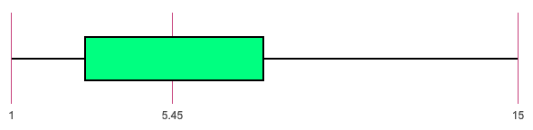
In this data, 1 is the minimum, Q1 is 3, the median is 5.45, Q3 is 8, and the maximum is 15.
To calculate outliers in a data set, first determine the interquartile range (IQR), which is the difference between the third quartile (Q3) and the first quartile (Q1): IQR = Q3 – Q1. Outliers are typically defined as data points that lie below Q1 – 1.5✕IQR or above Q3 + 1.5✕IQR. Any data points outside these boundaries are considered outliers.
For this particular example:
IQR = 8 - 3 = 5
Q1 - 1.5✕IQR = 3 - 1.5(5) = -4.5
So, any value below -4.5 would be considered an outlier.
Q3 - 1.5✕IQR = 8 + 1.5(5) = 15.5
So, any value above 15.5 would be considered an outlier.
Here’s a completely free and easy to use boxplot maker:
The following video shows how to create a box and whisker plot using Excel (Office 365 version).
The following video provides a demonstration on how to create a box and whisker plot using Rstudio. If you don’t have Rstudio, it can be downloaded for free at https://posit.co/download/rstudio-desktop/.
Here is the Base R code you can copy and edit to make your own box and whisker plot in Rstudio.
Sample data
data <- c(23, 45, 10, 56, 33, 25, 47, 55, 24, 44, 31, 50)
Create the boxplot
boxplot(data, main="Boxplot Example", ylab="Values", col="lightblue", border="darkblue")


© Unity Environmental University 2025. “America’s Environmental University.™”